Models are simplifications of reality, sometimes even very crude simplifications. Thus, we can never fully trust them. While hoping they are good enough is an option, we should try to do better. One general approach to criticizing model is to judge them by their predictions. If a model is robust, its predictions should align well with observations, domain knowledge, or some other benchmark. There are at least four avenues to explore:
Compare to prior knowledge. For example, if we are modelling the size of planets we can evaluate if the model is making predictions in a sensible range. Even if we are equipped with a very rudimentary knowledge of astronomy we know that planets are larger than persons and smaller than galaxies. So if the model is predicting that the size of a planet is 1 meter, then we know that the model is not that good. The better your prior knowledge is, the better you will be able to critique your model assumptions. If you are not an expert in the field, and maybe even if you are, you can always try to find someone who is.
Compare to observed data. We fit a model and compare the predictions to the same data that we used to fit the model. This is an internal consistency check of the model, and we should expect good agreement. But reality is complex and models can be too simple or they can be misspecified so there is a lot of potential in these types of checks. Additionally, even very good models might be good at recovering some aspects of the data but not others, for instance, a model could be good at predicting the bulk of the data, but it could overestimate extreme values.
Compared to unobserved data. We fit a model to one dataset and then evaluate it on a different dataset. This is similar to the previous point, but this is a more stringent test because the model is being asked to make predictions on data that it has not seen before. How similar the observed and unobserved data are will depend on the problem. For instance, a model trained with data from a particular population of elephants might do a good job at predicting the weight of elephants in general, but it might not do a good job at predicting the weight of other mammals like shrews.
Compare to other models. We fit different models to the same data and then compare the predictions of the models. This particular case is discussed in detail on Chapter 7.
As we can see there are plenty of options to evaluate models. But we still have one additional ingredient to add to the mix, we have omitted the fact that we have different types of predictions. An attractive feature of the Bayesian model is that they are generative. This means that we can simulate synthetic data from models as long as the parameters are assigned a proper probability distribution, computationally we need a distribution from which we can generate random samples. We can take advantage of this feature to check models before or after fitting the data:
Prior predictive: We generate synthetic observations without conditioning on the observed data. These are predictions that we can make before we have seen the actual data.
Posterior predictive: We generate synthetic observations after conditioning on the observed data. These are predictions that we can make after we have seen the data.
Additionally, for models like linear regression where we have a set of covariates, we can generate synthetic data evaluated at the observed covariates (our “Xs”) or at different values (“X_new”). If we do the first we call it in-sample predictions, and if we do the second we call it out-of-sample predictions.
With so many options we can feel overwhelmed. Which ones we should use will depend on what we want to evaluate. We can use a combination of the previous options to evaluate models for different purposes. In the next sections, we will see how to implement some of these checks.
5.1 Prior predictive checks
The idea behind prior predictive checks is very general and simple: if a model is good it should be able generate data resembling our prior knowledge. We call these checks, prior predictive because we are generating synthetic data before we have seen the actual data.
The general algorithm for prior predictive checks is:
Draw \(N\) realizations from a prior distribution.
For each draw, simulate new data from the likelihood.
Plot the results.
Use domain knowledge to assess whether simulated values reflect prior knowledge.
If simulated values do not reflect prior knowledge, change the prior distribution, likelihood, or both and repeat the simulation from step 1.
If simulated values reflect prior knowledge, compute the posterior.
Notice that in step 4 we use domain knowledge, NOT observed data!
In steps 1 and 2 what we are doing is approximating this integral: \[
p(y^\ast) = \int_{\Theta} p(y^\ast \mid \theta) \; p(\theta) \; d\theta
\]
where \(y^\ast\) represents unobserved but potentially observable data. Notice that to compute \(y^\ast\) we are evaluating the likelihood over all possible values of the prior. Thus we are effectively marginalizing out the values of \(\theta\), the parameters.
To exemplify a prior predictive check, let’s try with a super simple example. Let’s say we want to model the height of humans. We know that the heights are positive numbers, so we should use a distribution that assigns zero mass to negative values. But we also know that at least for adults using a normal distribution could be a good approximation. So we create the following model, without too much thought, and then draw 500 samples from the prior predictive distribution.
with pm.Model() as model: # Priors for unknown model parameters mu = pm.Normal('mu', mu=0, sigma=10) sigma = pm.HalfNormal('sigma', sigma=10)# Likelihood (sampling distribution) of observations y_obs = pm.Normal('Y_obs', mu=mu, sigma=sigma, observed=y)# draw 500 samples from the prior predictive idata = pm.sample_prior_predictive(samples=500, random_seed=SEED)
Sampling: [Y_obs, mu, sigma]
## coming soon
In the following plot, we can see samples from the prior predictive distribution (blue solid lines). If we aggregate all the individual samples into a single large sample we get the dashed cyan line. To help us interpret this plot we have added two reference values, the average length/height of a newborn and the average (male) adult height. These reference values, are values that are meaningful to the problem at hand that we obtain from domain-knowledge (not from the observed data). We used reference values to get a sense of the scale of the expected data. Expected or typical values could also be used.
We can see that our model is bananas, not only heights can be negative, but the bulk of the prior predictive distribution is outside of our reference values.
Figure 5.1: The prior predictive check for the model of heights. We can see that the bulk of the samples are outside the reference values.
We can tighten up the priors. There is no general rule to do this. For most problems, it is usually a good idea to set priors using some broad domain knowledge in such a way that we get a prior predictive distribution that allocates most of its mass in a reasonable region. These priors are called weakly informative priors. While there isn’t a formal definition of what a weakly informative prior is, we can think of them as priors that generate a prior predictive distribution with none to very little mass in disallowed or unlikely regions. For instance, we can use a normal distribution with a mean of 175 and a standard deviation of 10. This distribution doesn’t exclude negative values, but it assigns very little mass to them. Also is broad enough to allow for a wide range of values.
with pm.Model() as model: # Priors for unknown model parameters mu = pm.Normal('mu', mu=175, sigma=10) sigma = pm.HalfNormal('sigma', sigma=10)# Likelihood (sampling distribution) of observations y_obs = pm.Normal('Y_obs', mu=mu, sigma=sigma, observed=y)# draw 500 samples from the prior predictive idata = pm.sample_prior_predictive(samples=500, random_seed=SEED)
Sampling: [Y_obs, mu, sigma]
## coming soon
We repeat the previous plot with the new prior predictive distribution. We can see that the bulk of the prior predictive distribution is within the reference values. The model predicts values above 200 cm and below 150 cm, which are indeed possible but are less likely. You are free to pick other priors and other reference values. Maybe you can use the historical record for the taller and shorter persons in the world as33 reference values.
Figure 5.2: The prior predictive check for the model of heights with a more narrower prior than Figure 5.1. Predictions are closer to our domain knowledge about human heights.
Weakly informative priors can have practical advantages over very vague priors because adding some prior information is usually better than adding none. By adding some information we reduce the chances of spurious results or nonsensical results. Additionally, weakly informative priors can provide computational advantages, like helping with faster sampling.
Weakly informative priors can also have a practical advantage over informative priors. To be clear, if you have trustworthy informative priors you should use them, it doesn’t make sense to ignore information that you have. But in many setting informative priors can be hard to set, and they can be very time-consuming to get. That’s why in practice weakly informative priors can be a good compromise.
Figure 5.3: The prior predictive check for the model of heights. Same as Figure 5.2 but using empirical CDFs instead of KDEs.
When plotting many distributions, where each one spans a narrow range of values compared to the range spanned but the collection of distributions, it is usually a good idea to plot the cumulative distribution, like in the previous figure. The cumulative distribution is easier to interpret in these cases compared to plots that approximate the densities, like KDEs, histograms, or quantile dot plots.
Note
One aspect that is often overlooked is that even if the priors have little effect on the actual posterior, by doing prior predictive checks and playing with the priors we can get a better understanding of our models and problems. If you want to learn more about prior elicitation you can check the PreliZ library.
5.2 Posterior predictive checks
The idea behind posterior predictive checks is very general and simple: if a model is good it should be able generate data resembling the observed data. We call these checks, posterior predictive because we are generating synthetic data after seeing the data.
The general algorithm for posterior predictive checks is:
Draw \(N\) realizations from the posterior distribution.
For each draw, simulate new data from the likelihood.
Plot the results.
Use observed data to assess whether simulated values agree with observed values.
If simulated values do not agree with observations, change the prior distribution, likelihood, or both and repeat the simulation from step 1.
If simulated values reflect prior knowledge, compute the posterior.
Notice that in contrast with prior predictive checks, we use observations here. Of course, we can also include domain knowledge to assess whether the simulated values are reasonable, but because we are using observations we do more stringent evaluations.
In steps 1 and 2 what we are doing is approximating this integral: \[
p(\tilde y) = \int_{\Theta} p(\tilde y \mid \theta) \; p(\theta \mid y) \; d\theta
\]
where \(\tilde y\) represents new observations, according to our model. The data generated is predictive since it is the data that the model expects to see.
Notice that what we are doing is marginalizing the likelihood by integrating all possible values of the posterior. Therefore, from the perspective of our model, we are describing the marginal distribution of data, that is, regardless of the values of the parameters.
Continuing with our height example, we can generate synthetic data from the posterior predictive distribution.
with model:
    idata = pm.sample()
    pm.sample_posterior_predictive(idata, random_seed=SEED, extend_inferencedata=True)
Initializing NUTS using jitter+adapt_diag...
Multiprocess sampling (2 chains in 2 jobs)
NUTS: [mu, sigma]
Sampling 2 chains for 1_000 tune and 1_000 draw iterations (2_000 + 2_000 draws total) took 1 seconds.
We recommend running at least 4 chains for robust computation of convergence diagnostics
Sampling: [Y_obs]
## coming soon
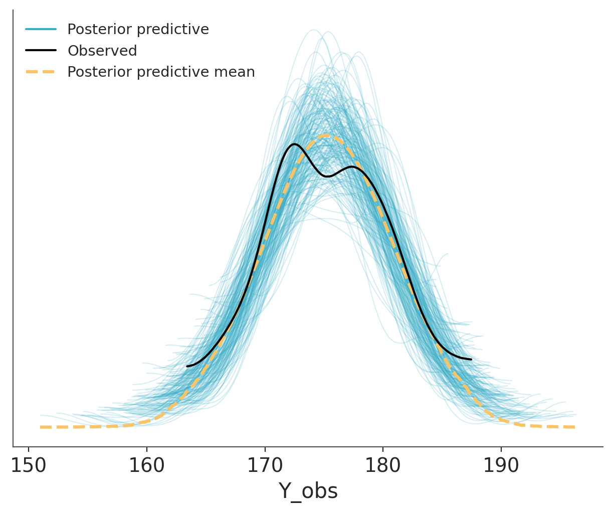
And then we use ArviZ to plot the comparison. We can see that the model is doing a good job at predicting the data. The observed data (black line) is within the bulk of the posterior predictive distribution (blue lines).
The dashed orange line, labelled as “posterior predictive mean”, is the aggregated posterior predictive distribution. If you combine all the individual densities into a single density, that’s what you would get.
Figure 5.4: Posterior predictive check for the model of heights.
Other common visualizations to compare observed and predictive values are empirical CDFs, histograms and less often quantile dotplots. Like with other types of visualizations, you may want to try different options, to be sure visualizations are not misleading and you may also want to adapt the visualization to your audience.
5.2.1 Using summary statistics
Besides directly comparing observations and predictions in terms of their densities, we can do comparisons in terms of summary statistics. Which ones, we decide to use may vary from one data-analysis problem to another, and ideally it should be informed by the data-analysis goals.
The following plot shows a comparison in terms of the mean, median and interquartile range (IQR). The dots at the bottom of each subplots corresponds to the summary statistics computed for the observed data and the KDE is for the model’s predictions.
Where \(T\) is the summary statistic of our choice, computed for both the observed data \(T_{\text{obs}}\) and the simulated data \(T_{\text{sim}}\).
This probabilities are often called Bayesian p-values, and their ideal value is 0.5, meaning that half of the predictions are below the observed values and half above.
The following paragraph is for those of you that are familiar with the p-values as used in frequentist statistics for null hypothesis testing and computation of “statistical significance”. If that’s the case you should be aware that the Bayesian p-values are something different. While frequentist p-values measure the probability of obtaining results at least as extreme as the observed data under the assumption that the null hypothesis is true, Bayesian p-values assess the discrepancy between the observed data and simulated data based on the posterior predictive distribution. They are used as a diagnostic tool to evaluate the adequacy of a model rather than as a measure of “statistical significance” or evidence against a null hypothesis.
Bayesian p-values are not tied to a null hypothesis and are not subject to the same kind of binary decision-making framework (reject/accept). Instead, they provide insight into how well the model, given the data, predicts the summary statistics. Values close to 0.5 indicates a well-calibrated model. However, the interpretation is more nuanced, as the goal is model assessment and improvement rather than hypothesis testing.
If you want to use plot_bpv to do the plots, but you prefer to omit the Bayesian p-values pass bpv=False. plot_bpv supports to other types of plots kind="p_value", that corresponds to computing
\[
p(\tilde y \le y_{\text{obs}} \mid y)
\]
that is, instead of using a summary statistics, as before, we directly compare observations and predictions. In the following plots the dashed black line represent the expected distribution.
az.plot_bpv(idata, kind="p_value");
Figure 5.6: Posterior predictive check for the model of heights using Bayesian p-values.
Another possibility is to perform the comparison per observation.
\[
p(\tilde y_i \le y_i \mid y)
\]
This is often called the marginal p-value and the ideal distribution is the standard uniform distribution.
The white line in the following figure represents the ideal scenario and the grey band the expected deviation given the size of the data. The x values corresponds to the quantiles of the original distribution, i.e. the central values represent the “bulk” of the distribution and the extreme values the “tails”.
az.plot_bpv(idata);
Figure 5.7: Posterior predictive check for the model of heights using marginal Bayesian p-values, also know as u-values.
To build intuition, let’s look at some synthetic data. The following plot shows four different scenarios, where the observed data follows a standard normal distribution (\(\mu=0, \sigma^2=1\)). In each case, we compare the observed data to predictions where:
The mean of the predictions is shifted to the right.
The mean of the predictions is shifted to the left.
The predictions have a wider spread (larger variance).
The predictions have a narrower spread (smaller variance).
Figure 5.8: Posterior predictive check for the model of heights using u-values and showing for alternative scenarios.
5.2.2 Hypothetical Outcome Plots
Another strategy that can be useful for posterior predictive plots is to use animations. Rather than showing a continuous probability distribution, Hypothetical Outcome Plots (HOPs) visualize a set of draws from a distribution, where each draw is shown as a new plot in either a small multiples or animated form. HOPs enable a user to experience uncertainty in terms of countable events, just like we experience probability in our day to day lives.
az.plot_ppc support animations using the option animation=True.
So far we have show examples with continuous data. Many of the tools can still be used for discrete data, for instance az.plot_ppc will automatically use histograms instead of KDEs when the data is discrete. And the bins of the histograms will be centred at integers. Also cumulative plots can be used for discrete data. Still, there are some tools that are more specific for discrete data. In the next sections we discuss posterior predictive checks for count data and binary data.
5.3.1 Posterior predictive checks for count data
Count data is a type of discrete data that is very common in many fields. For instance, the number of iguanas per square meter in a rainforest, the number of bikes in a bike-sharing station, the number of calls to a call center, the number of emails received, etc. When assessing the fit of a model to count data we need to consider the discretness of the data and that we usually care about the amount of (over/under-)dispersion.
Rootograms are a graphical tool to assess the fit of count data models (Tukey 1977; Kleiber and Zeileis 2016). There are a few variations of rootograms, but traditionally rootograms use bars for the predicted data, a lines+markers for the observed data and instead of plotting the raw data, they show the square root of the observed and predicted counts. Often the uncertainty in the predictions is omitted. The reason to square root the data is to make easier to compare observed and expected frequencies even for low frequencies.
Here we are going to discuss the rootograms presented by Säilynoja et al. (2025). These rootograms emphasises the discreteness of the data and predictions by using points and point-wise credible intervals. And instead of square-rooting the data, it set the y-axis on the square root scale, this makes easier to interpret the data, because we can directly read the frecuencies from the plot (instead of reading the square root) while keeping the advantage of being able to discriminate details at lower frecuencies.
To illustrate rootograms we are going to use the Horseshoe crabs dataset (Brockmann 1996). Very briefly, horseshoe crabs arrive at the beach in pairs for their spawning ritual. Solitary males gather around the nesting couples and vying to fertilize the eggs. These individuals, known as satellite males, often congregate near certain nesting pairs while disregarding others. We used Bambi to create two models a poisson model and a hurdle-negative binomial model for the number of male satellites as a function of the carapace width and color of the female.
We are going to omit the modelling details, and just upload prefitted models.
Let’s first check the poisson model. We can see that the overall fit is not that bad, but the zeros are underpredicted, and counts 1 to 4 are overpredicted. Most counts from 6 onward are also underpredicted. This pattern is an indication of overdispersion in the data, and the huge difference for 0 indicates an excess of zeros.
pc = azp.plot_ppc_rootogram(crabs_poisson)pc.viz["satellite"].plot.item().set_xlim(-0.5, 20)
Figure 5.9: Rootogram showing the uncertainty in the predictions for a Poisson model.
Now we will check the fit for the hurdle model. As expected for a hurdle model we get a perfect fit for the zeros. For the positive values, we still get some deviations, but the fit is better than with the Poisson model.
pc = azp.plot_ppc_rootogram(crabs_hurdle_nb)pc.viz["satellite"].plot.item().set_xlim(-0.5, 20)
Figure 5.10: Rootogram showing the uncertainty in the predictions for a Hurdle Negative Binomial model.
Both models predict more values in the tail than observed, even if with low probability. For both plots, we restrict the x-range to (0, 20).
5.3.2 Posterior predictive checks for binary data
Binary data is a common form of discrete data, often used to represent outcomes like yes/no, success/failure, or 0/1. Modelling binary data poses a unique challenge for assessing model fit because these models generate predicted values on a probability scale (0-1), while the actual values of the response variable are dichotomous (either 0 or 1).
One solution to this challenge was presented by (Greenhill, Ward, and Sacks 2011) and is a know as separation plot. This graphical tool consists of a sequence of bars, where each bar represents a data point. Bars can have one of two colours, one for positive cases and one for negative cases. The bars are sorted by the predicted probabilities, so that the bars with the lowest predicted probabilities are on the left and the bars with the highest predicted probabilities are on the right. Usually the plot also includes a marker showing the expected number of total events. For and ideal fit all the bars with one color should be on one side of the marker and all the bars with the other color on the other side.
The following example show a separation plot for a logistic regression model.
Greenhill, Brian, Michael D. Ward, and Audrey Sacks. 2011. “The Separation Plot: A New Visual Method for Evaluating the Fit of Binary Models.”American Journal of Political Science 55 (4): 991–1002. https://doi.org/https://doi.org/10.1111/j.1540-5907.2011.00525.x.
Kleiber, Christian, and Achim Zeileis. 2016. “Visualizing Count Data Regressions Using Rootograms.”The American Statistician 70 (3): 296–303. https://doi.org/10.1080/00031305.2016.1173590.
Säilynoja, Teemu, Andrew R. Johnson, Osvaldo A. Martin, and Aki Vehtari. 2025. “Recommendations for Visual Predictive Checks in Bayesian Workflow.”https://arxiv.org/abs/0000.00000.
Tukey, John W. 1977. Exploratory DataAnalysis. 1 edition. Pearson.