WARNING (pytensor.tensor.blas): Using NumPy C-API based implementation for BLAS functions.1 Elements of visualization
Plots occupy a central place in modern statistics, both in exploratory data analysis and inferential statistics.
Data visualization has an aesthetic and a scientific component. The challenge usually is to generate nice-looking graphics without losing the rigor and veracity of what you want to show. In this chapter, we will focus on the scientific component, but we will also give some tips on how to make the graphics look good.
Data visualization is a very broad area with graphical representations targeting very different audiences ranging from scientific papers for ultra-specialists to newspapers with millions of readers. We will focus on scientific visualizations and in particular visualizations useful in a Bayesian setting, but some of the principles we will discuss are general and can be applied to other types of visualizations.
Humans are relatively good at processing visual information, as a consequence data visualization is both a powerful tool for analyzing data and models and a powerful tool to convey information to our target audience. Using words, tables or just numbers is generally less effective in communicating information compared with visualizations. Nevertheless, our visual system can be fooled, as you may have experienced with visual illusions. The reason is that our visual system is not a perfect measurement device. Instead, it has been evolutionary-tuned to process information in ways that tend to be useful in natural settings and this generally means not just seeing the information, but interpreting it as well. Put less formally, our brains guess stuff and don’t just reproduce the outside world. Effective data visualization requires that we recognize the abilities and limitations of our visual system.
1.1 Coordinate systems and axes
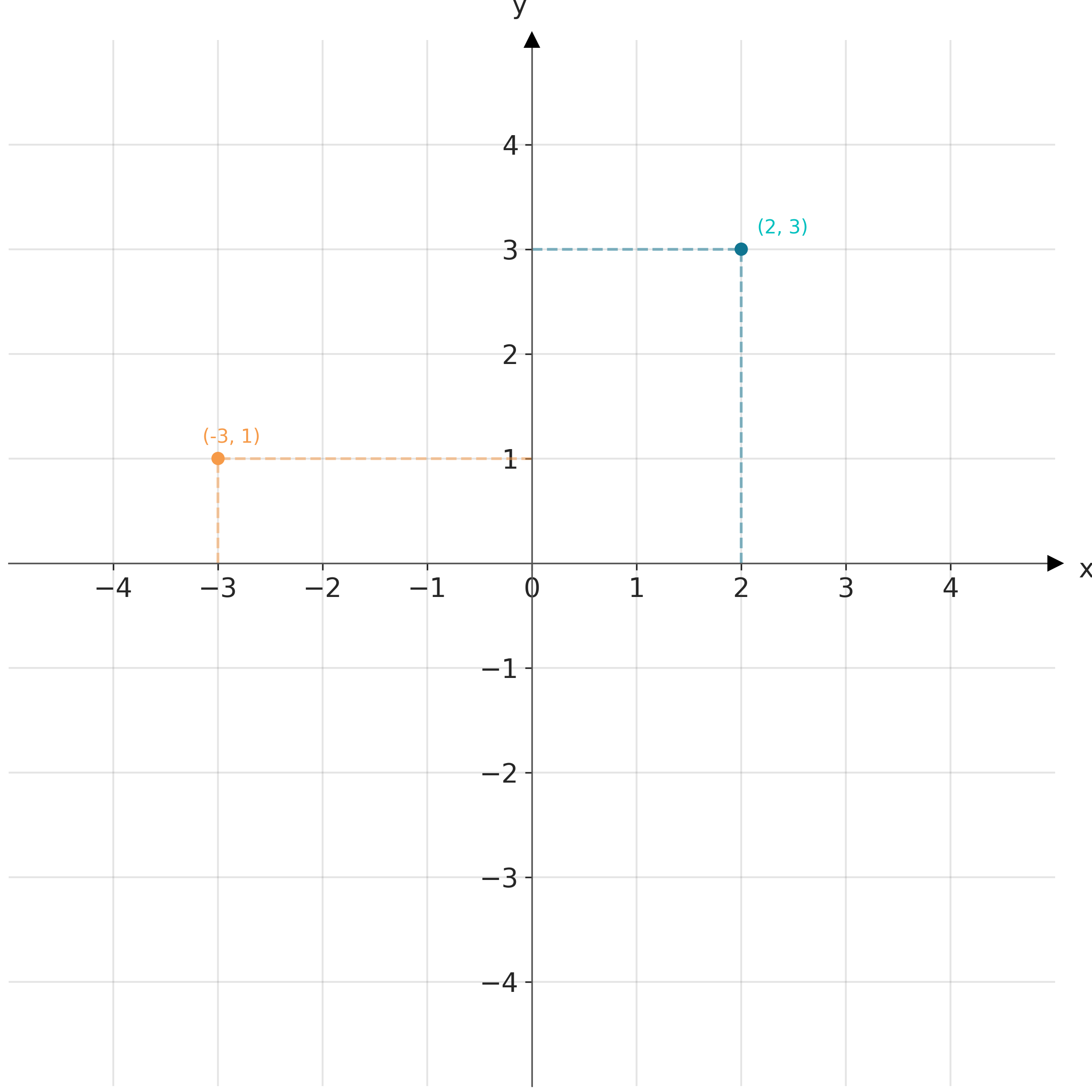
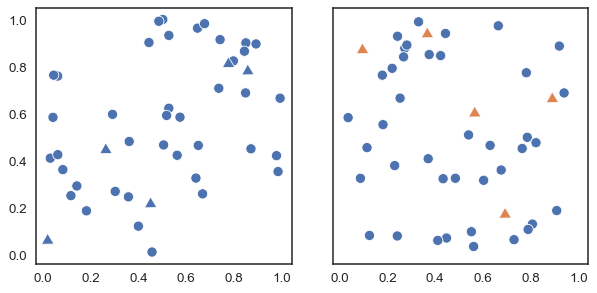
Data visualization requires defining position scales to determine where different data values are located in a graphic. In 2D visualizations, two numbers are required to uniquely specify a point. Thus, we need two position scales. The arrangement of these scales is known as a coordinate system. The most common coordinate system is the 2D Cartesian system, using x and y values with orthogonal axes. Conventionally with the x-axis running horizontally and the y-axis vertically. Figure 1.1 shows a Cartesian coordinate system.
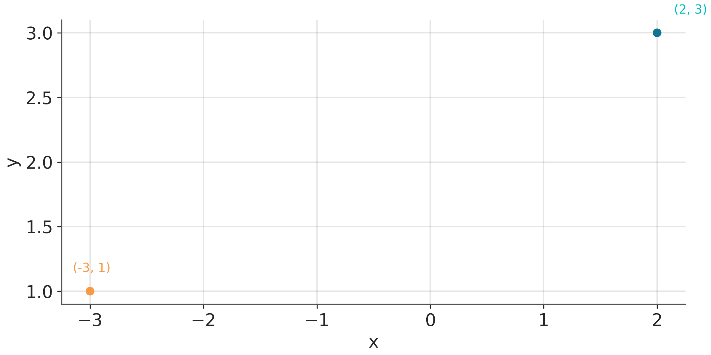
In practice, we typically shift the axes so that they do not necessarily pass through the origin (0,0), and instead their location is determined by the data. We do this because it is usually more convenient and easier to read to have the axes to the left and bottom of the figure than in the middle. For instance Figure 1.2 plots the exact same points shown in Figure 1.1 but with the axes placed automatically by matplotlib.
Usually, data has units, such as degrees Celsius for temperature, centimeters for length, or kilograms for weight. In case we are plotting variables of different types (and hence different units) we can adjust the aspect ratio of the axes as we wish. We can make a figure short and wide if it fits better on a page or screen. But we can also change the aspect ratio to highlight important differences, for example, if we want to emphasize changes along the y-axis we can make the figure tall and narrow. When both the x and y axes use the same units, it’s important to maintain an equal ratio to ensure that the relationship between data points on the graph accurately reflects their quantitative values.
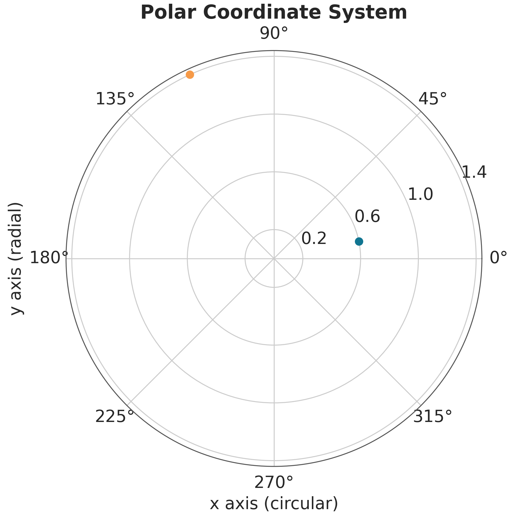
After the cartesian coordinate system, the most common coordinate system is the polar coordinate system. In this system, the position of a point is determined by the distance from the origin and the angle with respect to a reference axis. Polar coordinates are useful for representing periodic data, such as days of the week, or data that is naturally represented in a circular shape, such as wind direction. Figure Figure 1.3 shows a polar coordinate system.
1.2 Plot elements
To convey visual information we generally use shapes, including lines, circles, squares, etc. These elements have properties associated with them like, position, shape, and color. In addition, we can add text to the plot to provide additional information.
ArviZ uses both matplotlib and bokeh as plotting backends. While for basic use of ArviZ is not necessary to know about these libraries, being familiar with them is useful to better understand some of the arguments in ArviZ’s plots and/or to tweak the default plots generated with ArviZ. If you need to learn more about these libraries we recommend the official tutorials for matplotlib and bokeh.
1.3 Good practices and sources of error
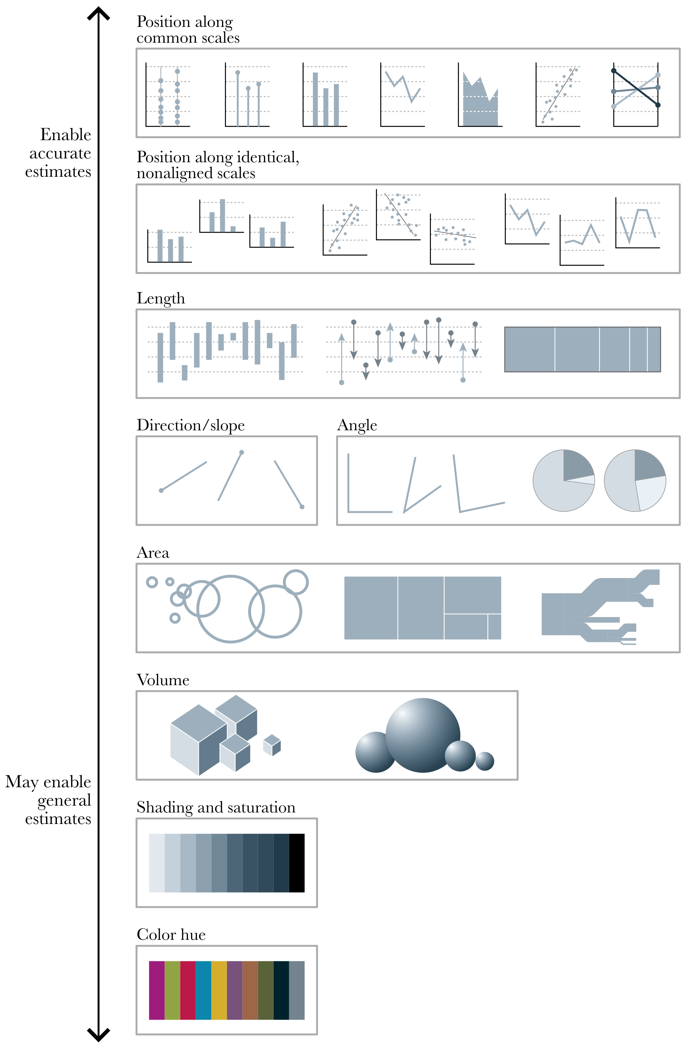
Using visualization to deceive third parties should not be the goal of an intellectually honest person, and you must also be careful not to deceive yourself. For example, it has been known for decades that a bar chart is more effective for comparing values than a pie chart. The reason is that our perceptual apparatus is quite good at evaluating lengths, but not very good at evaluating areas. Figure 1.4 shows different visual elements ordered according to the precision with which the human brain can detect differences and make comparisons between them (Cleveland and McGill 1984; Heer and Bostock 2010).
1.3.1 General principles for using colors
Human eyes work by essentially perceiving 3 wavelengths, this feature is used in technological devices such as screens to generate all colors from combinations of 3 components, Red, Green, and Blue. This is known as the RGB color model. But this is not the only possible system. A very common alternative is the CYMK color model, Cyan, Yellow, Magenta, and Black.
To analyze the perceptual attributes of color, it is better to think in terms of Hue, Saturation, and Lightness, HSL is an alternative representation of the RGB color model.
The hue is what we colloquially call “different colors”. Green, red, etc. Saturation is how colorful or washed out we perceive a given color. Two colors with different hues will look more different when they have more saturation. The lightness corresponds to the amount of light emitted (active screens) or reflected (impressions), ranging from black to white:
Varying the tone is useful to easily distinguish categories as shown in Figure 1.5.
In principle, most humans are capable of distinguishing millions of tones, but if we want to associate categories with colors, the effectiveness of distinguishing them decreases drastically as the number of categories increases. This happens not only because the tones will be increasingly closer to each other, but also because we have a limited working memory. Associating a few colors (say 4) with categories (countries, temperature ranges, etc.) is usually easy. But unless there are pre-existing associations, remembering many categories becomes challenging and this exacerbates when colors are close to each other. This requires us to continually alternate between the graphic and the legend or text where the color-category association is indicated. Adding other elements besides color such as shapes can help, but in general, it will be more useful to try to keep the number of categories relatively low. In addition, it is important to take into account the presentation context, if we want to show a figure during a presentation where we only have a few seconds to dedicate to that figure, it is advisable to keep the figure as simple as possible. This may involve removing items and displaying only a subset of the data. If the figure is part of a text, where the reader will have the time to analyze for a longer period, perhaps the complexity can be somewhat greater.
Although we mentioned before that human eyes are capable of distinguishing three main colors (red, green, and blue), the ability to distinguish these 3 colors varies between people, to the point that many individuals have difficulty distinguishing some colors. The most common case occurs with red and green. This is why it is important to avoid using those colors. An easy way to avoid this problem is to use colorblind-friendly palettes. We’ll see later that this is an easy thing to do when using ArviZ.
Varying the lightness as in Figure 1.6 is useful when we want to represent a continuous scale. With the hue-based palette (left), it’s quite difficult to determine that our data shows two “spikes”, whereas this is easier to see with the lightness-modifying palette (right). Varying the lightness helps to see the structure of the data since changes in lightness are more intuitively processed as quantitative changes.
One detail that we should note is that the graph on the right of Figure 1.6 does not change only the lightness, it is not a map in gray or blue scales. That palette also changes the hue but in a very subtle way. This makes it aesthetically more pleasing and the subtle variation in hue contributes to increasing the perceptual distance between two values and therefore the ability to distinguish small differences.
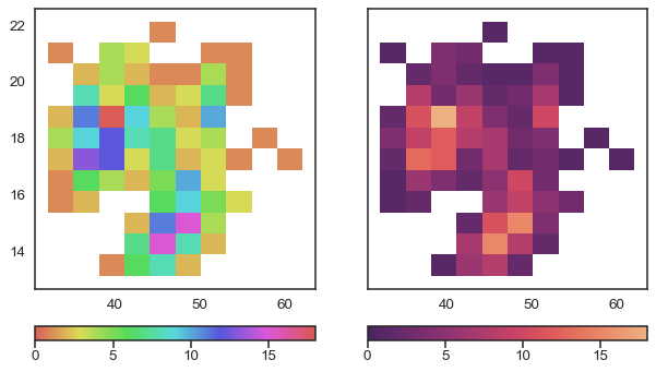
When using colors to represent numerical variables it is important to use uniformly perceptual maps like those offered by matplotlib or colorcet. These are maps where the colors vary in such a way that they adequately reflect changes in the data. Not all colormaps are perceptually uniform. Obtaining them is not trivial. Figure 1.7 shows the same image using different colormaps. We can see that widely used maps such as jet (also called rainbow) generate distortions in the image. In contrast viridis, a perceptually uniform color map does not generate such distortions.
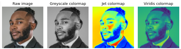
A common criticism of perceptually smooth maps is that they appear more “flat” or “boring” at first glance. And instead maps like Jet, show greater contrast. But that is precisely one of the problems with maps like Jet, the magnitude of these contrasts does not correlate with changes in the data, so even extremes can occur, such as showing contrasts that are not there and hiding differences that are truly there.
1.4 Style sheets
Matplotlib allows users to easily switch between plotting styles by defining style sheets. ArviZ is delivered with a few additional styles that can be applied globally by writing az.style.use(name_of_style) or inside a with statement.
azp.style.use('arviz-clean')
x = np.linspace(0, 1, 100)
dist = pz.Beta(2, 5).pdf(x)

fig = plt.figure()
for i in range(10):
    plt.plot(x, dist - i, f'C{i}', label=f'C{i}', lw=3)
plt.xlabel('x')
plt.ylabel('f(x)', rotation=0, labelpad=15);
/opt/hostedtoolcache/Python/3.10.15/x64/lib/python3.10/site-packages/numba/np/ufunc/dufunc.py:287: RuntimeWarning: divide by zero encountered in nb_logpdf
return super().__call__(*args, **kws)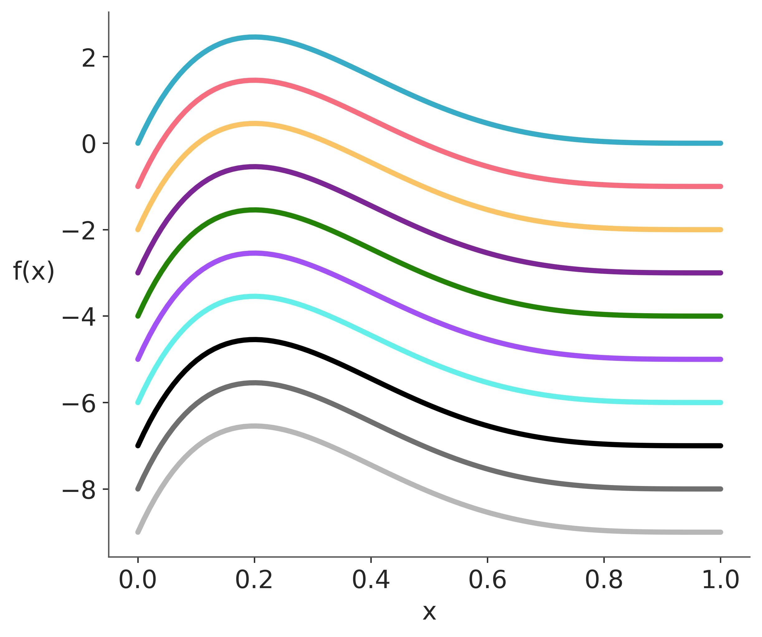
The color palettes in ArviZ were designed with the help of colorcyclepicker. Other pallettes distributed with ArviZ are 'arviz-cetrino', and 'arviz-vibrant'. To list all available styles use azp.style.available().
If you need to do plots in grey-scale we recommend restricting yourself to the first 3 colors of the ArviZ palettes (“C0”, “C1” and “C2”), otherwise, you may need to use different line styles or different markers.