Code
Visualizations occupy a central place in modern statistics. Visualizations help us identify patterns, detect anomalies, formulate hypotheses, and gain an intuitive understanding of the data (Wilke 2019; Healy 2019; Unwin 2024). These are tasks usually associated with the exploratory data analysis (EDA) phase (Tukey 1977; Downey 2025). But visualizations are also essential for other tasks like understanding model behaviour, diagnostic computational issues, validating assumptions and communicating results.
To understand why visualizations are so effective in these tasks, it helps to consider how the human visual system processes information. Humans are naturally skilled at processing visual information. Compared to words, tables, or raw numbers, well-crafted visualizations tend to convey information more efficiently and intuitively. However, our visual system can be fooled, as you may have experienced with visual illusions. The reason is that our visual system is not a perfect measurement device. Instead, it has been evolutionary-tuned to process information in ways that tend to be useful in the natural settings our ancestors lived. In other words, our brains don’t just see, they guess, infer, and create. Effective data visualization requires us to account for both the strengths and the limitations of our visual system.
Given these perceptual constraints, designing effective data visualizations requires careful attention to both how accurately data is represented and how clearly it is perceived. Data visualization inherently involves both an aesthetic and a scientific dimension. On one hand, the scientific component ensures that the visual representation accurately and faithfully conveys the underlying data, supporting robust analysis and clear communication. On the other hand, the aesthetic component is concerned with the clarity, elegance, and visual appeal of the graphics, which can greatly influence how easily the viewer grasps the message being presented. The challenge usually is to generate nice-looking graphics without losing the rigor and veracity of what you want to show.
Striking this balance depends not just on the data or the design choices, but also on the audience. Different audiences have different needs and expectations. For example, a visualization intended for a scientific audience may prioritize accuracy and detail, while one aimed at a general audience may focus on clarity and simplicity. The same data can be visualized in many different ways, each with its own strengths and weaknesses. The choice of visualization method should be guided by the specific goals of the analysis and the characteristics of the data. In this book, we will focus on visualizations that are useful for statistical analysis.
At its core, data visualization is the process of representing data in a visual format with the goal of making complex information more accessible, understandable, and actionable. By using simple visual elements like points, lines, and shapes, we can reveal structure, highlight relationships, and expose patterns that might otherwise remain hidden in raw numbers.
Two well-known synthetic—and somewhat extreme—examples that highlight the importance of looking at data, and not just relying on numerical summaries,are Anscombe’s quartet, which consists of four datasets with nearly identical summary statistics but very different visual patterns, and the Datasaurus Dozen, a collection of datasets that appear statistically similar but reveal drastically different shapes when plotted. While these are constructed examples, similar situations often arise in real-world data. For instance, I’ve repeatedly seen cases where a researcher claims a linear regression fits the data well—only to discover upon visual inspection that the data actually consist of two distinct clusters, likely generated by different underlying processes or belonging to separate classes.
When discussing data visualization, there are many terms that are not always used consistently across different sources. To help avoid confusion, we will define a few key terms, as they are used in this book and in the ArviZ library:
At a higher level we have a figure, all the element of our visualization are contained inside a figure, a synonym for figure is chart. A figure can contain one or more plots, other terms for plot are subplot or panel. We compose plots by adding visuals to them. They are the basic elements that we can see in a plot, like a point, a line, or a bar. Other names for visuals are aesthetics, geometric object or glyphs. Visuals has properties that can be modified, such as color, size, and shape. We call these properties aesthetics. It’s very common to use different aesthetics to represent different variables in a plot. For example, if we are plotting information for different countries, we can use different color to represent each country. We can say that the color is an aesthetic that encodes the country variable, this is often referred to as mapping or to be less ambiguous as aesthetic mappings. Alternative to a color we can use faceting, that is to create one plot per variable (like country). In practice, we usually combine faceting and aesthetic mappings to represent different variables. For example, we can use different colors to represent different countries and create a separate plot for each year. This allows us to create reach visualizations while keeping them easy to read.
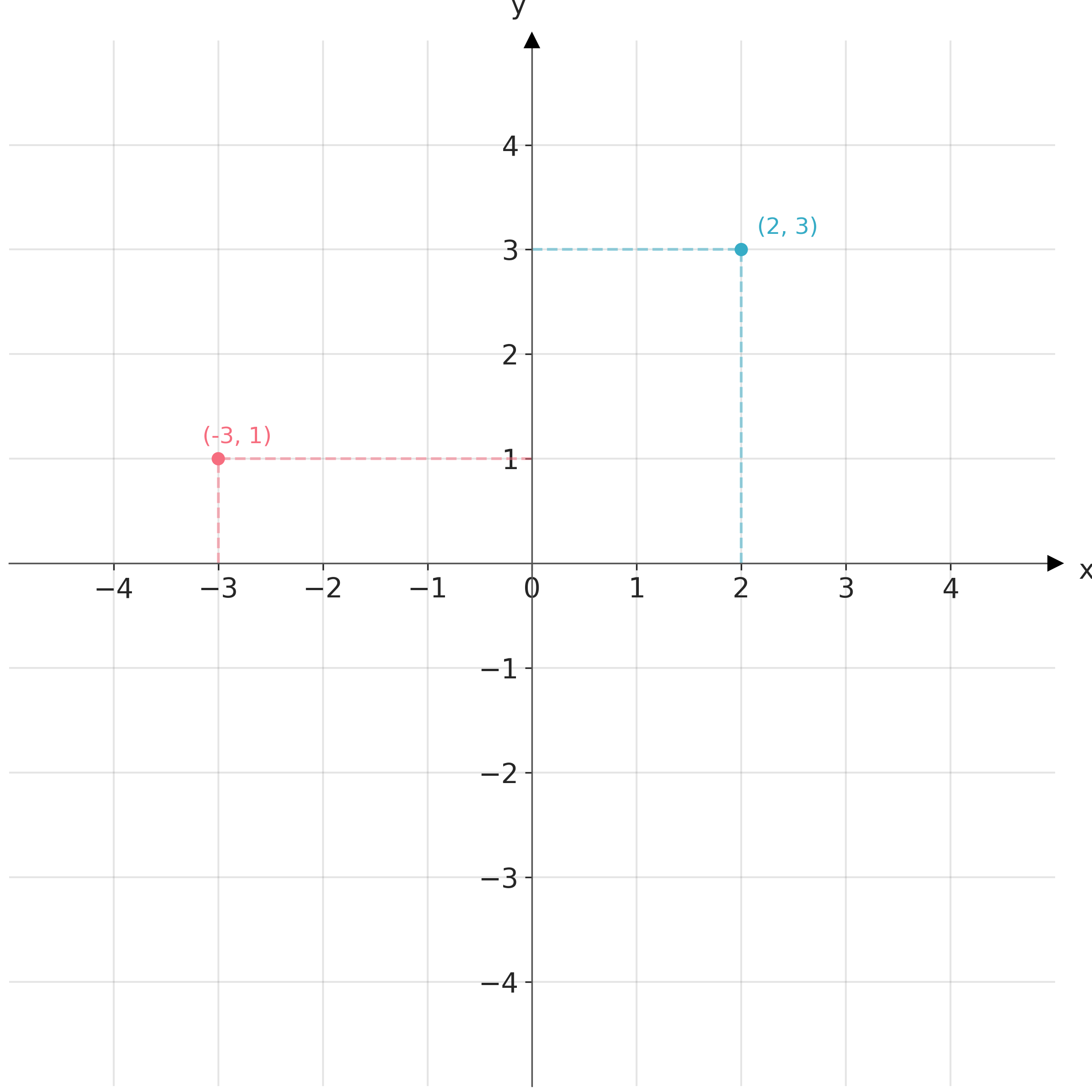
Data visualization requires defining position scales to determine where different data values are located in a graphic. In 2D visualizations, two numbers are required to uniquely specify a point. Thus, we need two position scales. The arrangement of these scales is known as a coordinate system. The most common coordinate system is the 2D Cartesian system, using x and y values with orthogonal axes. Conventionally, the x-axis runs horizontally and the y-axis vertically. Figure 1.1 shows a Cartesian coordinate system.
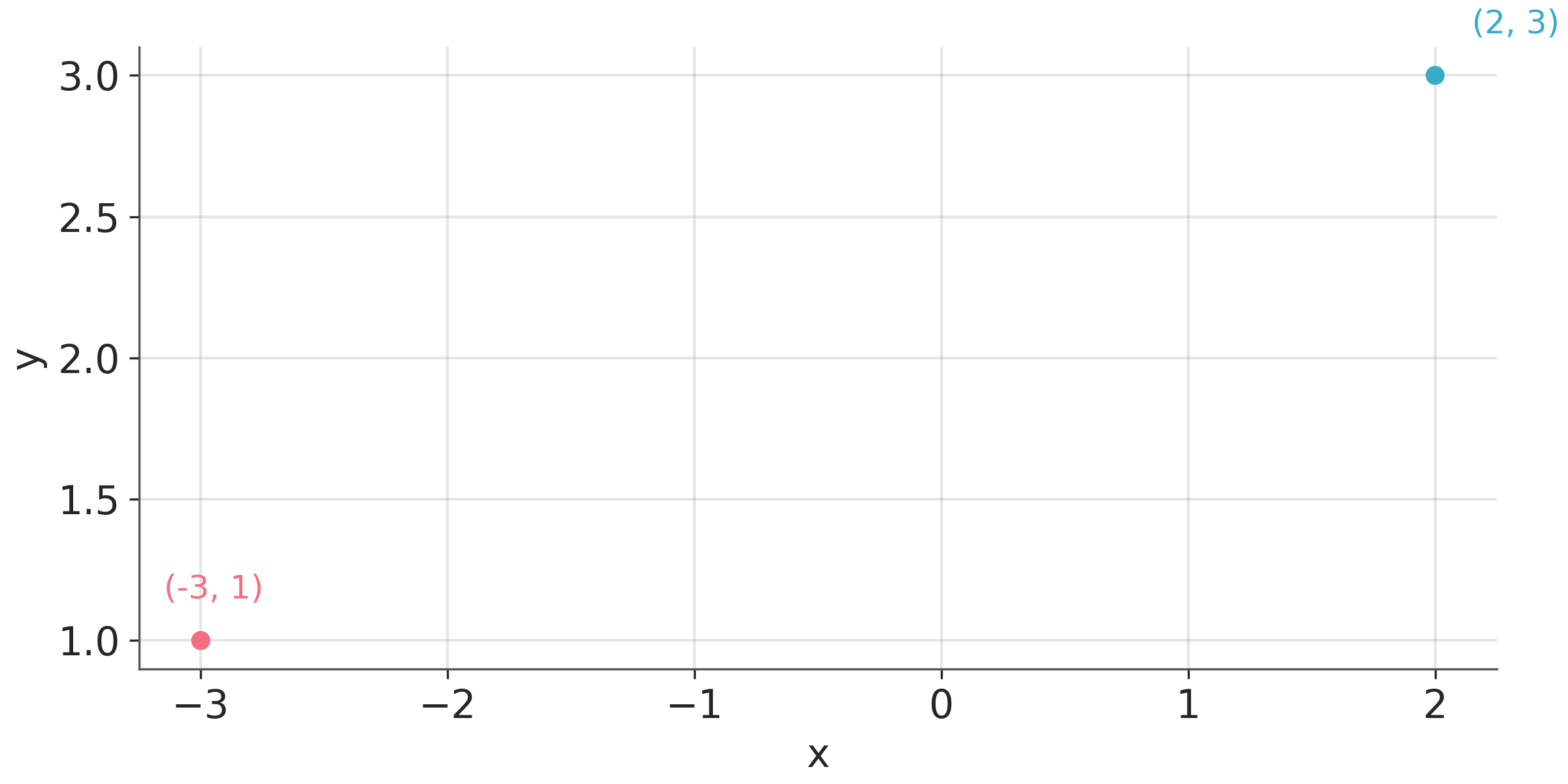
In practice, we typically shift the axes so that they do not necessarily pass through the origin (0,0), and instead, their location is determined by the data. We do this because it is usually more convenient and easier to read to have the axes to the left and bottom of the figure than in the middle. For instance, Figure 1.2 plots the same points shown in Figure 1.1 but with the axes placed automatically by matplotlib.
Usually, data has units, such as degrees Celsius for temperature, centimetres for length, or kilograms for weight. In case we are plotting variables of different types (and hence different units), we can adjust the aspect ratio of the axes as we wish. We can make a figure short and wide if it fits better on a page or screen. But we can also change the aspect ratio to highlight important differences. For example, if we want to emphasize changes along the y-axis, we can make the figure tall and narrow. When both the x and y axes use the same units, it’s important to maintain an equal ratio to ensure that the relationship between data points on the graph accurately reflects their quantitative values.
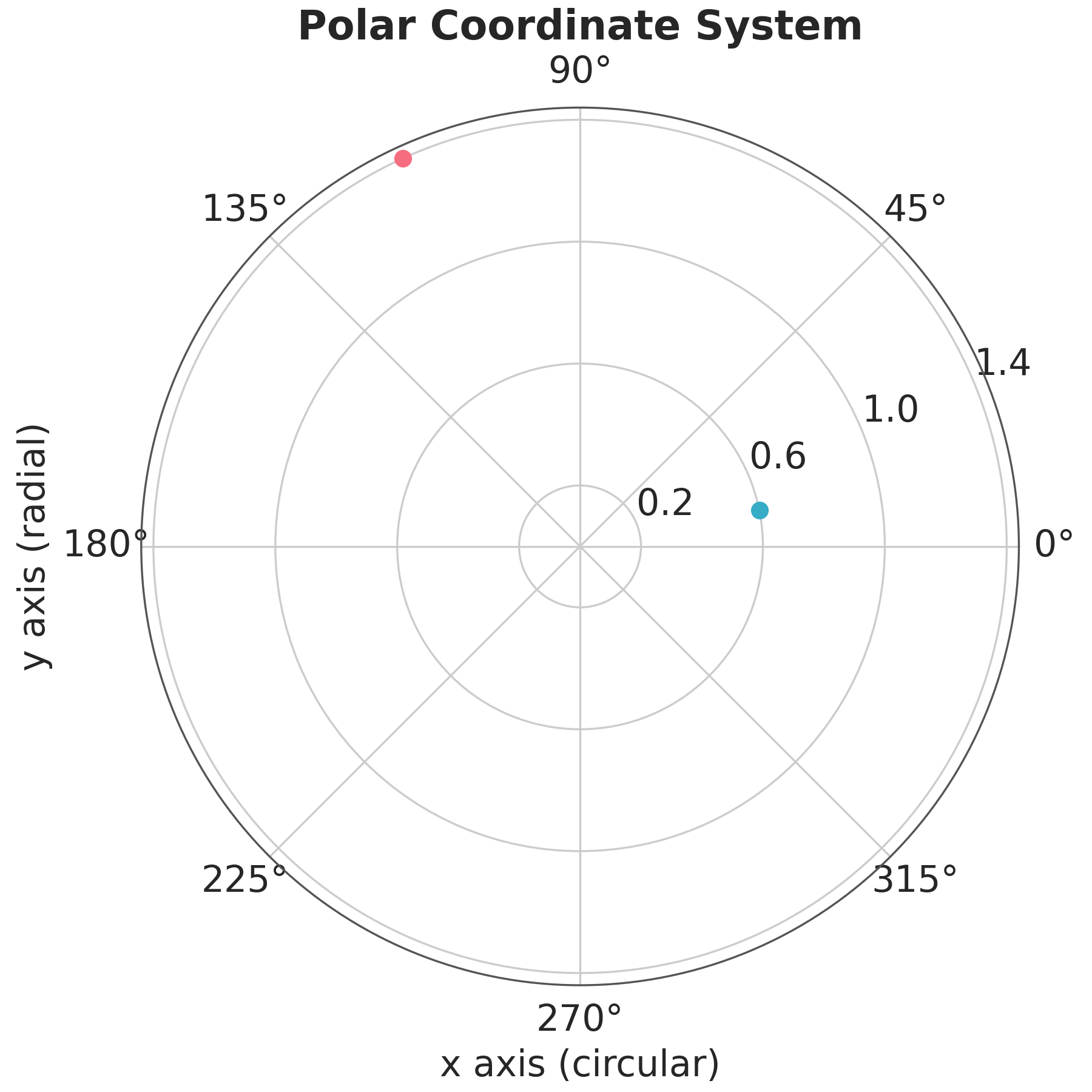
After the Cartesian coordinate system, the most common coordinate system is the polar coordinate system. In this system, the position of a point is determined by the distance from the origin and the angle with respect to a reference axis. Polar coordinates are useful for representing periodic data, such as days of the week, or data that is naturally represented in a circular shape, such as wind direction. Figure Figure 1.3 shows a polar coordinate system.
Using visualization to deceive third parties should not be the goal of an intellectually honest person, but without being careful, we can deceive ourselves and other without even realizing it. For example, it has been known for decades that bar-plots are more effective for comparing values than a pie-charts. The reason is that our perceptual apparatus is quite good at evaluating lengths, but not very good at evaluating areas. Figure 1.4 shows different visual elements ordered according to the precision with which the human brain can detect differences and make comparisons between them (Cleveland and McGill 1984; Heer and Bostock 2010).
Human eyes work by essentially perceiving 3 wavelengths. This feature is used in technological devices such as screens to generate all colours from combinations of 3 components, Red, Green, and Blue. This is known as the RGB color model. But this is not the only possible system. A very common alternative is the CYMK color model, Cyan, Yellow, Magenta, and Black.
To analyze the perceptual attributes of color, it is better to think in terms of Hue, Saturation, and Lightness, HSL is an alternative representation of the RGB color model.
The hue is what we colloquially call “different colours”. Green, red, etc. Saturation is how colourful or washed out we perceive a given color. Two colours with different hues will look more different when they have more saturation. The lightness corresponds to the amount of light emitted (active screens) or reflected (impressions), ranging from black to white:
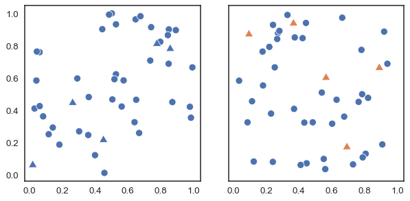
Varying the tone is useful to easily distinguish categories, as shown in Figure 1.5.
In principle, most humans are capable of distinguishing millions of tones, but if we want to associate categories with colours, the effectiveness of distinguishing them decreases drastically as the number of categories increases. This happens not only because the tones will be increasingly closer to each other, but also because we have a limited working memory. Associating a few colours (say 4) with categories (countries, temperature ranges, etc.) is usually easy. But unless there are pre-existing associations, remembering many categories becomes challenging, and this exacerbates when colours are close to each other. This requires us to continually alternate between the graphic and the legend or text where the color-category association is indicated. Adding other elements besides color, such as shapes, can help, but in general, it will be more useful to try to keep the number of categories relatively low. In addition, it is important to take into account the presentation context, if we want to show a figure during a presentation where we only have a few seconds to dedicate to that figure, it is advisable to keep the figure as simple as possible. This may involve removing items and displaying only a subset of the data. If the figure is part of a text, where the reader will have the time to analyze for a longer period, perhaps the complexity can be somewhat greater.
Although we mentioned before that human eyes are capable of distinguishing three main colours (red, green, and blue), the ability to distinguish these 3 colours varies between people, to the point that many individuals have difficulty distinguishing some colours. The most common case occurs with red and green. This is why it is important to avoid using those colours. An easy way to avoid this problem is to use color-blind-friendly palettes. We’ll see later that this is an easy thing to do when using ArviZ.
Varying the lightness, as in Figure 1.6 is useful when we want to represent a continuous scale. With the hue-based palette (left), it’s quite difficult to determine that our data shows two “spikes”, whereas this is easier to see with the lightness-modifying palette (right). Varying the lightness helps to see the structure of the data since changes in lightness are more intuitively processed as quantitative changes.
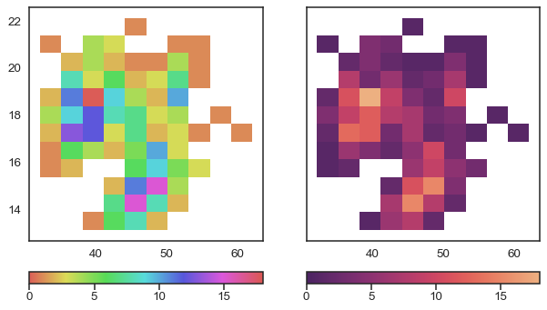
One detail that we should note is that the graph on the right of Figure 1.6 does not change only the lightness; it is not a map in gray or blue scales. That palette also changes the hue, but in a very subtle way. This makes it aesthetically more pleasing, and the subtle variation in hue contributes to increasing the perceptual distance between two values and therefore the ability to distinguish small differences.
When using colours to represent numerical variable,s it is important to use uniformly perceptual maps like those offered by matplotlib or colorcet. These are maps where the colours vary in such a way that they adequately reflect changes in the data. Not all colormaps are perceptually uniform. Obtaining them is not trivial. Figure 1.7 shows the same image using different colormaps. We can see that widely used map,s such as jet (also called rainbow) generate distortions in the image. In contrast, viridis, a perceptually uniform color map, does not generate such distortions (more details here).
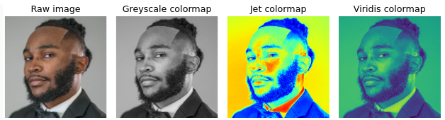
A common criticism of perceptually smooth maps is that they appear more “flat” or “boring” at first glance. And instead maps like Jet, show greater contrast. But that is precisely one of the problems with maps like Jet, the magnitude of these contrasts does not correlate with changes in the data, so even extremes can occur, such as showing contrasts that are not there and hiding differences that are truly there.
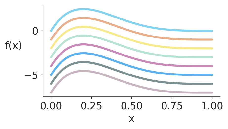
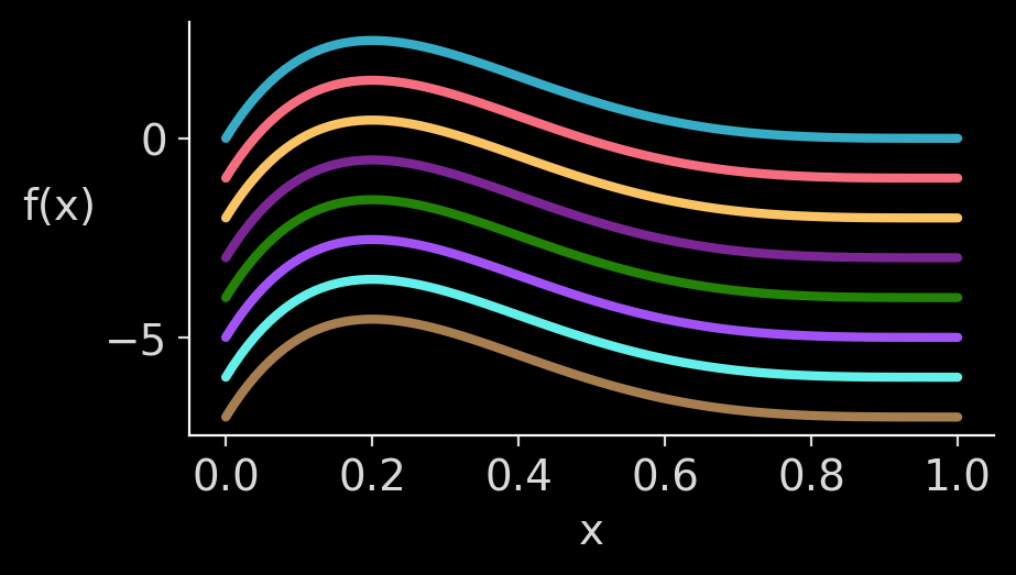
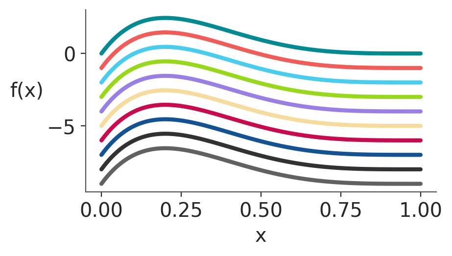
Matplotlib allows users to easily switch between plotting styles by defining style sheets. ArviZ is delivered with a few additional styles that can be applied globally by writing az.style.use(name_of_style) or inside a with statement.
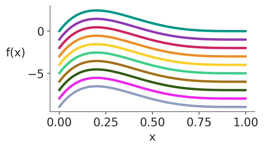
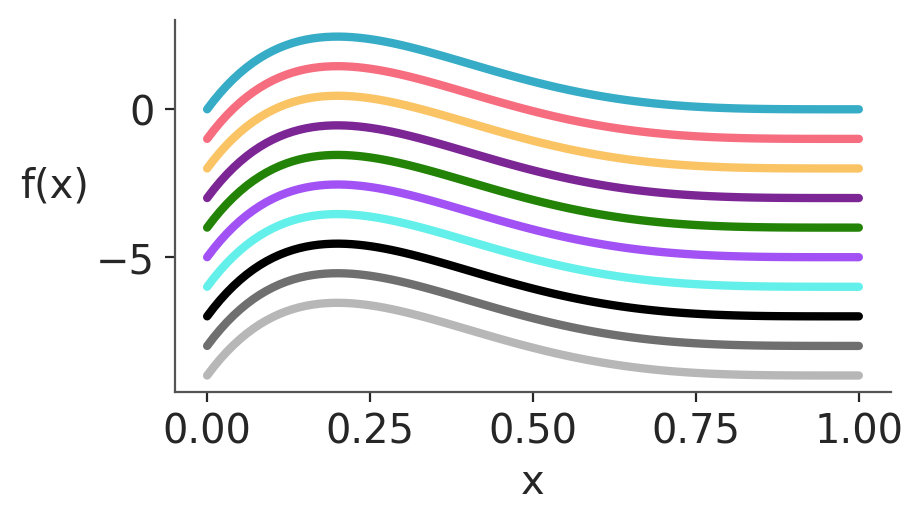
The color palettes in ArviZ were designed with the help of colorcyclepicker to minimize the risk of confusion for people with color vision deficiencies. We also follow the recommendation from Wilke (2019) and restrict the color palette to a maximum of 8 colors. If you need to use many colors, it’s recommended to explore alternatives like using different line styles, different markers, faceting, or direct labelling.
If you need to create figures in grayscale, you can use the first 3 colours of the arviz-vibrant palette and then convert to grayscale. But remember to check that the result looks goods after the conversion.